21 modules · Part 1 of 6. Each module below is rendered with its default field values beneath its name, file path and description.
Banners & Heroes
Simple Hero
modules/Banner.module
The theme's primary hero banner. Editors choose a background type (image, video or color): background image fields exist for desktop and mobile, video uses a poster image plus a background video URL, and an optional overlay blends two configurable overlay colors. Content fields include a heading, sub heading, event date and event location lines (each with its own color control), an inline image, an optional colored divider, and a richtext description. A buttons repeater (max 2, default 1) renders theme buttons with text, link, size and style choices inside a buttons container. Layout options cover content alignment, container width, center alignment toggle, custom classes, a custom anchor ID, and responsive spacing at desktop, laptop, tablet and mobile breakpoints; there is no JavaScript.
Example: At the top of nearly any zonar.com page, such as the homepage or a school bus fleet solutions page, an editor would set a full-width background photo of a fleet, a headline like Smarter Fleet Management Starts Here, a supporting sentence, and Request a Demo plus Learn More buttons.
Proven smart fleet management technology for safety and efficiency.
Trusted leader to help protect our nation’s children. The clear choice for you.
A highly configurable landing page hero with split or centered layout modes and a background choice of image, video URL or flat color, including a separate mobile background image and an optional two-color overlay. Left-column content includes an announcement badge, eyebrow, heading with selectable tag, rich-text description, up to 6 icon bullet highlights, an optional star rating with value and label, up to 6 trust badges with three placement options, up to 8 customer logos, up to 4 metric counters, up to 2 buttons in the full Zonar style system, microcopy, and an optional video popup button. The right column media_content choice shows a HubSpot form (with editable title, submit style, alignment and pricing teaser), rich text, an image, an embedded video with thumbnail, or nothing, and layout controls cover column swap, 50-50, 60-40 or 40-60 ratios, vertical and text alignment, max widths, entrance animations (none, fade-in, slide-up), backdrop-blurred form panel, column divider and scroll indicator. JavaScript converts YouTube and Vimeo URLs to embed form and opens the video popup or click-to-play embedded video in a modal.
Example: Used as the top of a paid-traffic Get Pricing landing page: split layout with a fleet photo background, benefit bullets and trust badges on the left, and a blurred-panel pricing form titled Get Pricing on the right.
Announcement Badge
Eyebrow Text
Landing Page Hero
Conversion-focused hero for landing pages with headline, supporting copy and prominent CTA placement.
Microcopy—small, specific pieces of text on websites or apps that guide users.
Pricing Teaser
Form Goes Here:
Landing Page Hero
modules/lp-hero.module
A large, do-everything landing page hero with announcement badge, eyebrow, headline (h1 or h2), subheadline, rich text description, optional bullet list (with icons), star rating group, banner logo image, and a metric counters repeater of value/label pairs. The CTA group holds a buttons repeater with six styles and three sizes, sub-CTA text and an optional video popup button; the media slot can show an image, YouTube/Vimeo embed, self-hosted video, Arcade interactive demo, an embedded form with title, or rich text, and a separate background media group supports a background image or self-hosted video with focal point control. A trust bar shows customer logos, a stat line, animated-style metric groups or combinations, and there are A/B variant fields for an alternate headline and subheadline plus anchor ID and custom class fields. The very large styles group covers split or centered layout, alignment, min height, per-device spacing, split ratio and media side, media radius and aspect, gradient overlays with direction, backdrop blur, column divider, scroll indicator, entrance animation (none, fade-in, slide-up) and a dozen-plus individual color controls; JavaScript lazy-loads the video embed (YouTube nocookie or Vimeo) and the Arcade iframe only when the visitor clicks the play or trigger element.
Example: The top of a paid-traffic ELD compliance landing page: headline 'ELD compliance without the headaches', three bullets, a primary 'Get pricing' button, an embedded short demo form on the right, and a trust bar of fleet customer logos beneath.
Announcement Badge
Fleet Safety Platform
Safer Fleets, Lower Costs
Real-time GPS tracking, driver coaching, and compliance tools — built for fleets of every size.
Optional longer body copy shown below the subheadline. Supports paragraphs and basic formatting.
A slim band that renders a single rich-text field inside a width-constrained container, with an editable content max width defaulting to 1150px. Style options are a background color and responsive spacing for desktop, laptop, tablet and mobile, and a section ID field allows anchor linking. There is no JavaScript and no other fields.
Example: Used as a short transitional statement between page sections, for example a one-line message like Trusted by leading school districts nationwide on the pupil transportation page.
Slim full-width heading strip used to introduce a page or major section without a full hero.
Full Width Image
modules/Full Width Image Module.module
A section that displays a single large image, optionally preceded by a heading. Editors set the heading text, the image, and a container width number that defaults to 1183 pixels to control how wide the image area is. The style group offers a background color, an optional background image, a heading text color, and responsive spacing for four breakpoints (the tablet control is named table_spacing in the fields), plus a custom anchor ID. There is no JavaScript.
Example: Placed mid-page on a product page to show a full-width dashboard screenshot of Zonar Ground Traffic Control under a short heading like See everything in one view.
Announcement Bar
modules/Announcement bar.module
Renders a slim full-width announcement strip whose richtext message scrolls horizontally like a marquee; the message is duplicated in an announce-track element and animated with a 25-second looping CSS animation that pauses on hover. Editors can set the richtext content, section background color, responsive spacing at desktop, laptop, tablet and mobile breakpoints, and a custom anchor ID. The bar is hidden on mobile viewports below 768px. No JavaScript is used. This module is a duplicate of the Annoucement Bar module (same fields and markup, different field IDs), likely created to fix the spelling of the module name.
Example: An editor would place this in the site header area to promote a limited-time offer or new product launch, such as announcing Zonar Coach availability, with the message scrolling continuously across the bar.
Zonarsystems.com is now Zonar.com. Please update your bookmarks.
Zonarsystems.com is now Zonar.com. Please update your bookmarks.
Thank You Page Section
modules/TY Page Section.module
A thank-you page module that conditionally reveals solution content based on URL parameters. It renders a heading and rich text paragraph, then an unlimited accordion_group repeater where each block has an icon, a title (used as the data-solution key) and a nested unlimited repeater of resource items (image, link, title, text); a separate icon_text_group repeater renders simple icon-plus-title link tiles. Style fields cover background color, heading text color and responsive spacing. JavaScript reads query string parameters starting with s (s1, s2, s3) and shows only the accordion blocks whose solution name matches a selected value, hiding the rest, and drives jQuery slide-toggle accordion behavior where opening one title closes the others.
Example: After a prospect submits a multi-select demo request form, the thank-you page URL carries their chosen solutions (s1=GPS Tracking, s2=EVIR) and this module shows follow-up resources only for those products.
Your message made it, safe and sound.
Thank you for reaching out. While we prepare a response, take a moment to see which Zonar solutions may also be worth a conversation.
Articles
Articles
Content & Media
Two Column Text
modules/Two Col Text.module
Renders a simple two-column text section: the left column has an H2 heading and rich text description, while the right column has an H4 heading above a list of short text items from an unlimited add_role text repeater, each rendered as a paragraph. The style group sets a background image and color, separate colors for the left heading, right heading and the role text, and desktop, laptop, tablet and mobile spacing. There is no JavaScript. A custom ID field supports anchor linking.
Example: On a zonar.com careers or webinar page, an editor would put an About This Session description on the left and a Who Should Attend heading on the right with roles like Fleet Manager, Safety Director and Dispatcher listed beneath it.
This was built for Zonar together.
Let’s get out from behind our desks, ToDo lists and fleet platforms. Instead, let’s meet (in person) and connect (also in person) at the upcoming Zonar Together user conference.
Zonar Together is about more than fleet tech and facetime. This is an opportunity to come together.
Connect with peers, industry leaders and our experts.
Learn more strategies, tools and out-of-the-box ideas.
Leave with more ideas to bring out your fleet’s best.
By the end of Zonar Together, you’ll be empowered with practical strategies, proven solutions and stronger connections to move your operation forward.
Who should attend
Safety Managers
Safety Managers
Safety Managers
Safety Managers
Two Column Text + Image
modules/Two Col Text Image.module
Renders a two-column hero-style band with heading, rich text description and an optional button (five style variants, three sizes, left/center/right alignment) on the left and a single image on the right. The section background layers a fixed blue-gray linear gradient over an editor-chosen background image, with a fallback background color, and the style group also sets the heading color and four-breakpoint spacing. There is no JavaScript. A custom ID field supports anchor linking.
Example: On a zonar.com solution page, an editor would pair a headline like Smarter Fleet Management Starts Here with a Get a Demo button and a tablet screenshot of the Ground Traffic Control dashboard.
Skip the RFP. Get down to procurement.
We’re a Sourcewell supplier, which means Sourcewell members can procure Zonar fleet technology through the cooperative instead of going through the RFP process.
Sourcewell is a member-owned cooperative that helps thousands of student transportation organizations like yours access what they need, faster and at lower costs. All contracts already meet public purchasing laws, so your organization stays compliant. Plus, as a Zonar customer, our 24/7/365 Zonar support will be here to help any time you need.
A centered call-to-action band with a heading, rich-text body content, and a single button group offering editable text, link, six button styles (primary through simple), three sizes, and left, center or right alignment. Style options are background color, heading text color and responsive spacing for desktop, laptop, tablet and mobile, plus a custom anchor ID. There is no JavaScript.
Example: Used as the closing section of a solution page with the heading Ready to modernize your fleet, a sentence of supporting copy, and a centered primary Get pricing button.
Unique Selling Proposition Section
Lorem ipsum dolor sit amet, consectetur adipiscing elit, sed do eiusmod tempor incididunt ut labore et dolore magna aliqua. Ut enim ad minim veniam, quis nostrud exercitation ullamco laboris nisi ut aliquip ex ea commodo consequat. Duis aute irure dolor in reprehenderit in voluptate velit esse cillum dolore eu fugiat nulla pariatur.
A large flexible content-and-media section that renders an optional section heading, an optional sticky top anchor bar (topbar_group repeater of titles with scroll IDs, line colors, hover colors and bar background), and a content_group repeater of content blocks. Each block has a heading with divider line color, richtext description, a full button group (text, link, style, size, alignment), and a media choice between an image-with-content layout, a text-and-button layout, or a video; videos can open in a Magnific Popup lightbox with a thumbnail image, and images support tooltips (toggle plus circle color, title, richtext content and link), uneven border radius, shadow, side swapping, and optional richtext text below the image. Style options include background, section heading and heading colors, four-breakpoint spacing, side text max width, section max width, a decorative spiral image, custom class and custom ID. The JavaScript wires the video popup open/close behavior through jQuery Magnific Popup.
Example: On a Zonar EVIR or fault-code product page, an editor would build alternating image/text blocks explaining inspection workflows, add a demo video that opens in a popup, and use the anchor top bar to let visitors jump between Features, How It Works and Pricing sections.
Put safety front, center and behind the wheel.
Prevent accidents and protect against false claims. Capture events as they unfold and help drivers self-correct at the moment with AI-powered, in-cab safety tech and smarter-than-your-average dashcams.
A numbered step-by-step process section with a heading, rich-text subheading, and a steps repeater (min 1, max 6) where each step has an icon image, title, rich-text description and an optional link. The style group is unusually granular with ten colors: heading, subheading, background, step number text and background, the connector line between steps, card background and border, and title and description colors, plus responsive spacing at four breakpoints. An SEO group toggle can emit HowTo structured data schema, off by default. There is no JavaScript.
Example: Placed on the Emissions Check page to walk prospects through three steps: plug in the device, drive as usual, and submit compliant CARB scans automatically.
How It Works
Get started in just a few simple steps.
1
Refer a Fleet
Submit your referral through our simple online form. Just provide basic contact details for the fleet you're referring.
2
We Reach Out
Our sales team connects with your referral to understand their fleet needs and present tailored solutions.
3
Earn Your Reward
When the referred fleet signs on, you receive your commission reward. It's that simple.
Support Section
modules/Support Section.module
Renders a support features grid plus an optional floating CTA bar. The content group holds a section heading and a features repeater of 1 to 8 cards, each with a Bootstrap Icons class name, title and description text; the module loads the Bootstrap Icons stylesheet from a CDN. A show_cta boolean reveals a call-to-action bar with its own heading and a full button group (text, link, six style variants, three sizes). Style fields set background, heading, icon, card title, card text, CTA background and CTA text colors plus responsive spacing. No JavaScript.
Example: On the zonar.com customer support page, an editor would list cards like 24/7 phone support, Online knowledge base and Dedicated account manager, with a floating bar prompting Contact Support Now.
Back and Support
Best-in-class support
Real experts who respond quickly—so you keep fleets moving
Dedicated specialists
Talk to an expert who really knows your operation
Professional installation
We handle hardware installs at no cost
Live online training
Get teams up to speed fast
Prove we’re not just another option — we’re the benchmark.
modules/Two Column Image and Key Features module.module
Renders a two-column block with an image on the left and a key features column on the right containing an H2 (styled as H3) heading, rich text content typically used for a feature list, and an optional button with six style variants (default primary), three sizes (default regular) and left/center/right alignment. The style group sets the section background color, heading color and desktop, laptop, tablet and mobile spacing, and a custom ID enables anchor links. There is no JavaScript.
Example: On a zonar.com product detail page, an editor would place a hardware photo of the Zonar V4 TCU beside a Key Features bulleted list and a See Specifications button.
Key features
Sed ut perspiciatis unde omnis iste natus error sit
unde omnis iste natus error sit voluptatem accusantium
Sed ut perspiciatis unde omnis iste natus error sit voluptatem
perspiciatis unde omnis iste natus error sit voluptatem accusantium
A compact horizontal callout with an icon image on the left and a title plus rich-text content on the right. Editors can set the content max width (default 1150px) and a section ID for anchor links. Style options are a background color and responsive spacing for desktop, laptop, tablet and mobile. There is no JavaScript.
Example: Placed on an installation or support page as a note like Prefer to self-install, with a wrench icon and a sentence linking to the self-installation guide.
Prefer to self-install?
Our priority is that you’re set up for success, whether you choose our professional services or self-install instead. If you’re confident about performing a full-scale installation, or you just need to outfit a few new vehicles, we’ll provide tailored, in-depth training to teach you how.
Text With Pop-Up Video
modules/Text With PopUp Video.module
Renders a full-width banner with a heading, rich text description and a play button that opens an embedded video in a magnificPopup lightbox. Editors set the play button text, the video embed code as rich text, whether the button is shown, its alignment, and whether the text block sits on the left or right of the section. The style group layers a four-stop linear gradient overlay (four color fields plus a -90deg or 90deg direction choice) over a background image, sets the heading color, and provides desktop, laptop, tablet and mobile spacing. A custom ID field supports anchor linking.
Example: On a solutions overview page on zonar.com, an editor would place a fleet vehicle background photo with a gradient wash, a headline like See Zonar in Action, and a Watch Video button that pops up a two-minute product overview.
Smarter fleet management, safer students.
The deeper you know your fleet, the more you can do with each bus and every driver. Take less than two minutes to learn how Zonar smart fleet management solutions protect students, keep parents informed and maximize operational efficiency.
App Slideshow
modules/App Slideshow.module
Renders a slideshow pairing an app screenshot image with a headline and richtext body per slide, with a mobile-specific image placement inside the text column. The slides repeater (min 1, no max) holds a slide title, image, headline and body. Style options cover background, text and accent colors, plus responsive spacing at three breakpoints; a navigation group offers booleans to show dots and arrows and an autoplay toggle with an interval number field. The JavaScript implements classic prev/next arrow and dot navigation that hides all slides and displays the active one, with parallel function sets supporting up to three independent slideshow instances on a page. Custom class and custom ID fields allow targeting.
Example: On the Zonar Ground Traffic Control or Zonar Coach product page, an editor would add four slides showing app screens with headlines like Live GPS Tracking or Driver Scorecards, each with a short benefit description.
Renders a compact process explainer for the Detroit Connect Virtual Technician integration: a heading, separate desktop and mobile diagram images, four step text fields, and a footer note. Each step field ships with a default describing the flow (Virtual Technician detects a fault code, a report goes to Detroit Customer Support, engineers investigate severe issues, and the customer receives an emailed diagnosis and action plan), so the module works out of the box. The steps render as a bulleted list beneath the diagram. The module.js is an empty placeholder; all presentation is CSS.
Example: On a zonar.com OEM partnership page for Daimler or Freightliner fleets, an editor would upload the Detroit Connect workflow diagram and lightly edit the four step descriptions to match current messaging.
How Detroit Connect Virtual Technician works
●
Virtual Technician detects an engine fault code.
●
A report is automatically sent to Detroit Customer Support.
●
If the issue is severe, Detroit Customer Support engineers investigate and identify solutions.
●
You receive an email report, with diagnosis and recommended action plan.
EVIR Inspections Gallery
modules/art_evir_inspections.module
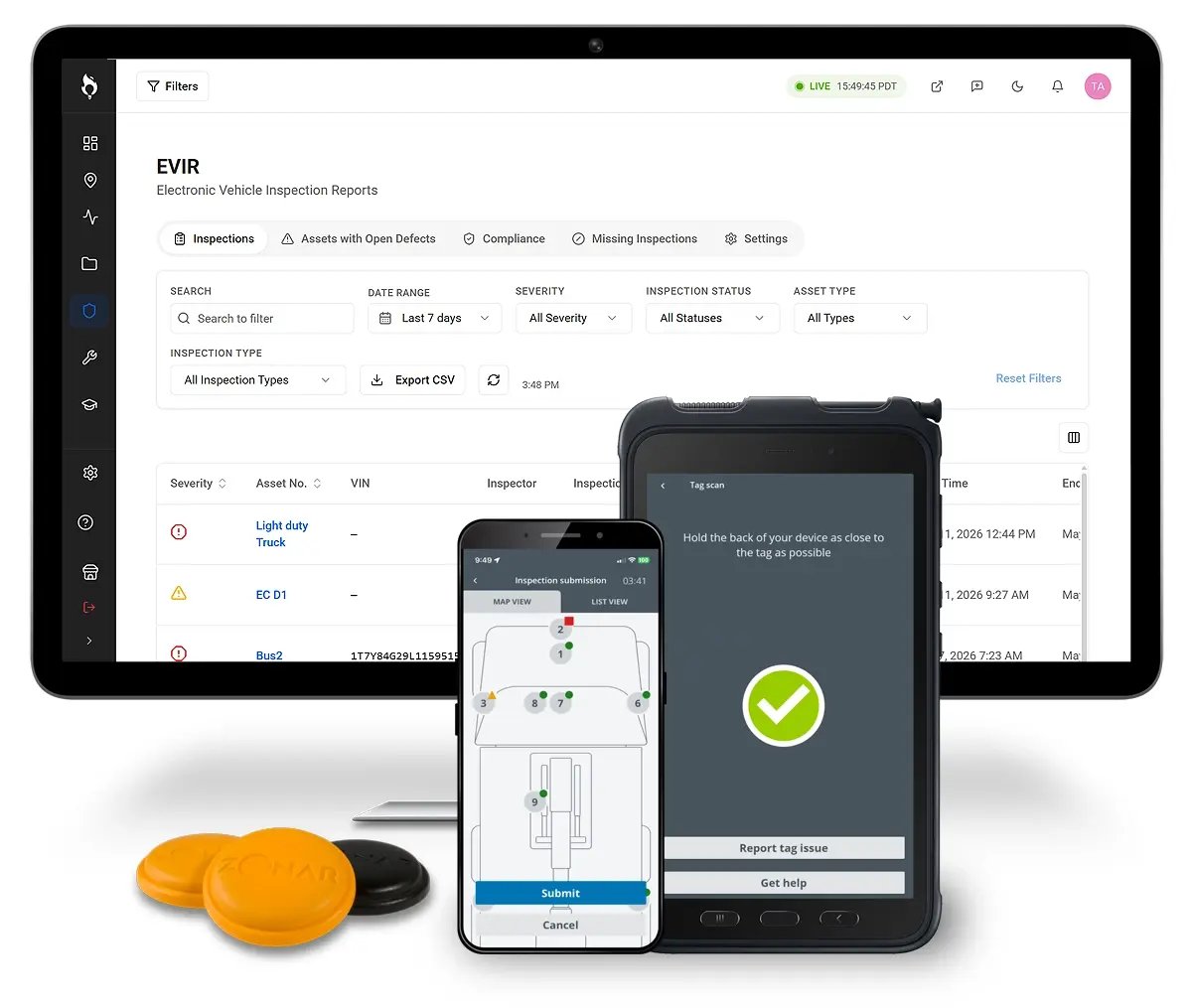
Renders an EVIR inspections showcase with a content column (heading, rich text description, optional primary-button CTA with label and URL) alongside an image gallery driven by an items_group repeater of 1 to 20 labeled images. The item labels render twice: as an accessible tab list of buttons under the content and as figure captions on the gallery slides, with the first item active by default. A settings group provides a section ID, top and bottom spacing choices (0, s, m, l with medium default) and a hide-on-mobile toggle, plus a separate custom ID field. Vanilla JavaScript wires the tab buttons so clicking one swaps the active slide and updates aria-selected and aria-hidden states, scoped per module instance.
Example: On zonar.com's EVIR product page, an editor would add configuration tabs like Pre-Trip, Post-Trip and Tag Scan, each showing a screenshot of that inspection workflow in the gallery.
Configuration LabelConfiguration Label 2
LP – Content + Feature Media
modules/lp-content-feature.module
A two-column feature section pairing text content with media: eyebrow, rich text heading and body copy, a bullets repeater (up to 8, each with text and icon), and a buttons repeater (up to 2) with the six theme button styles. The media group supports an image, a self-hosted video file with poster, autoplay, controls and caption track options, or an embedded video URL, plus alt text and a caption. Styles control media position (left or right), column ratio (media narrow, balanced, media wide), vertical alignment, padding presets, media aspect ratio (auto, 16:9, 4:3, 1:1, 3:2), border radius, bullet marker style (check, dot, arrow, none), and background, text and accent colors. There is no module JavaScript.
Example: On a Zonar Coach driver safety landing page, an editor places dashcam footage on the right with a headline about AI-driven coaching, three check-style bullets on safety outcomes, and a 'See it in action' button.
Eyebrow Text
Section heading
Supporting paragraph explaining the value.
Bullet Text
Bullet Text
Bullet Text
LP – Product Demo
modules/lp-product-demo.module
A product demo section with a heading (h2 or h3) and four demo types: an Arcade interactive tour, an embedded YouTube/Vimeo video, a self-hosted video with poster, autoplay, controls and captions, or a screenshots repeater (1 to 6 images with callout text). For Arcade, a mobile behavior choice offers inline, tab or popup, and JavaScript injects the Arcade iframe only after the visitor clicks the trigger; for video, JavaScript auto-fetches a YouTube thumbnail when no custom one is set and swaps in a privacy-friendly youtube-nocookie or Vimeo autoplay embed on click. An optional CTA area adds a buttons repeater (up to 2) with the theme's button styles, plus a caption field. Styles include background and text colors, four max widths, padding presets, center or left alignment, media radius up to xl, and an accent color.
Example: Midway down a Zonar Ground Traffic Control landing page, an editor embeds an Arcade walkthrough of the fleet dashboard set to popup on mobile, with a 'Start free tour' style trigger and a 'Book a live demo' button below.