
Zonar Theme 2026 — Module Library
Tabs & Interactive
13 modules · Part 3 of 6. Each module below is rendered with its default field values beneath its name, file path and description.
Tabs & Interactive
Tabbed Module
modules/Tabbed Module.module
A left-rail tabbed section where an unlimited add_tab repeater creates vertical tab headings, each with per-tab heading color plus default, hover and active background colors. Each tab's content chooses between Two Column and Icon Text types: Two Column holds an unlimited repeater of rows with heading, divider line color, rich text, a five-style button group, image with configurable per-corner radius and shadow, an optional tooltip hotspot with circle color, title, content, link and pixel positioning, and a swap toggle; Icon Text holds an image, heading, description, button and an optional nested three-column repeater of title and text blocks with a max width setting. Section styles include background image and color, section and card heading colors, card background and responsive spacing. The jQuery script initializes each tabbed container independently, activating the first tab and switching panels on heading clicks.
Example: On a page like Fleet Management Solutions, an editor would build side tabs for Track, Inspect, Coach and Comply, each revealing rows of feature descriptions with annotated product screenshots and tooltip callouts.
Zonar Bus Suite
-
Customer success
No guesswork, no wrong turns
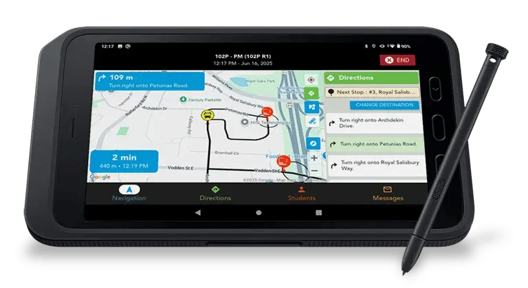
Even substitute drivers will follow routes like veterans. Turn-by-turn directions on their tablet guide every stop, so no one improvises. Update routes in seconds. Message drivers directly. Solve issues before parents hear about them.
Tabbing Module
modules/Tabbing Module.module
Renders a tabbed industry-style section with a section heading, a row of clickable tab headings, and per-tab content panels containing a heading, rich text description, an optional button (three sizes, five style variants, left/center/right alignment) and an image, plus a decorative circle image. Tabs come from an unlimited add_tab repeater, and each tab's content is split into a text column and an image column. A style group controls the background image and color, section heading color, tab heading colors (default, active, hover and active background colors), card heading and card background colors, and responsive spacing for desktop, laptop, tablet and mobile. JavaScript switches behavior by viewport: above 767px it works as classic tabs with fade-in panel transitions, while on mobile each tab collapses into an accordion with slide up/down drawers.
Example: On an industry landing page such as zonar.com's trucking or school bus fleet page, an editor would create tabs like Compliance, GPS Tracking and Inspections, each pairing a short pitch and a Learn More button with a product screenshot.
What’s your industry?
Customer success
Customer success
Commercial trucking
We partner with commercial trucking fleets of every size and range to prioritize vehicle health, optimize every trip, raise driver retention, and reduce violations. We’re with you for the long haul, even across the Canadian border.

Tabbed Feature Showcase
modules/Tabbed Feature Showcase.module
The theme's most feature-rich tab module: an eyebrow, heading (H2 or H3), rich text subheading, optional customer logo bar (1 to 8 logos with a label), and 1 to 8 tabs. Each tab carries a title and optional icon, rich text content, up to 6 icon bullets, per-tab heading color, text color and heading size overrides, and a media type choice of Image, modal Video, embedded YouTube or Vimeo video with aspect ratio options, HubSpot Form with title and submit style, Rich Text, or no media, plus media position left or right and a per-tab link styled as text link or one of three buttons. Below the tabs sit an optional animated stat bar (2 to 4 stats), an optional testimonial with quote, name, title, company and photo, a CTA button with microcopy, and optional trust badges (1 to 6). The extensive style group covers colors for every element, gradient backgrounds, tab strip styling, horizontal or vertical tab layout, image effects and stat animation duration, while an advanced group adds tab auto-play with interval, anchor ID and custom classes. JavaScript handles delegated tab activation with keyboard support, IntersectionObserver-triggered eased stat counters, and a dialog-based video modal that builds YouTube and Vimeo autoplay embeds.
Example: On a flagship product page such as Zonar Coach, an editor would build tabs for Driver Scorecards, Video Coaching and Reporting, each with a screenshot or demo video, then close with a customer testimonial, a 3-stat proof bar and a Request a Demo CTA.
Features & Capabilities
Explore the tools built to keep your fleet moving.
Feature Title
Describe this feature and how it helps your users accomplish their goals more effectively.
Feature Title
Describe this feature and how it helps your users accomplish their goals more effectively.
Feature Title
Describe this feature and how it helps your users accomplish their goals more effectively.
Two Column Tab
modules/Two Col Tab.module
Renders a section heading above a two-column tab layout: clickable tab headings stacked on the left and content panels on the right, each panel pairing a text column (heading, rich text description, optional button with five style variants, three sizes and alignment) with an image column. Tabs come from an unlimited add_tab repeater. The style group controls section background image and color, section heading color, left tab heading colors including active state and a mobile_screen subgroup with tab background, hover, active background and active text colors, plus right panel heading color, card background color and four-breakpoint spacing. JavaScript toggles the active tab heading and matching content panel on click, scoped to the section so multiple instances work independently.
Example: On a zonar.com product family page, an editor would create tabs for Ground Traffic Control, ZTrak and EVIR, each showing a feature summary, a Learn More button and a product screenshot.
Commitment comes standard.
Customer success
Commercial trucking
We partner with commercial trucking fleets of every size and range to prioritize vehicle health, optimize every trip, raise driver retention, and reduce violations. We’re with you for the long haul, even across the Canadian border.

Two Column Tabbed
modules/Two Col Tabbed.module
Renders a section heading and optional rich text intro above a horizontal tab bar whose items are styled per-tab: each tab in the unlimited add_tab repeater carries its own heading color plus background, hover and active background colors injected as scoped CSS. Each tab's content group offers a content_type choice (icon_text or two_column); the two-column layout holds a heading with an optional colored divider line, rich text description, a button (five style variants, three sizes, alignment) and an add_image repeater of media items, each of which can be an image or a video link with its own rich text heading. Section styles include background image and color, section and card heading colors, card background color and four-breakpoint spacing. JavaScript initializes each tab container independently, activating the first tab and wiring click switching, and builds Slick sliders with custom SVG arrows and dots for the media galleries.
Example: On a zonar.com platform overview page, an editor would create color-coded tabs for Safety, Compliance and Maintenance, each with explanatory copy on the left and a small slider of screenshots or demo videos on the right.
Zonar Bus Suite
All Zonar-supported camera hardware feeds AI-detected events directly into Zonar Ignition. And links the video to trips, drivers and vehicles to reduce time spent investigating what happened and why. Choose the camera that fits your fleet, and manage everything on a single, secure online platform.
Consider your fleet and browse each camera’s features to match. Questions? Contact us.
-
Customer success
-
Customer success
No guesswork, no wrong turns
Even substitute drivers will follow routes like veterans. Turn-by-turn directions on their tablet guide every stop, so no one improvises. Update routes in seconds. Message drivers directly. Solve issues before parents hear about them.
No guesswork, no wrong turns
Even substitute drivers will follow routes like veterans. Turn-by-turn directions on their tablet guide every stop, so no one improvises. Update routes in seconds. Message drivers directly. Solve issues before parents hear about them.
Zonar DashCam DF22 (dual-facing)
Two Column Tab With Background Image
modules/Two Col Tab With BG Image.module
A variant of the two-column tab module where the right content panel gets its own background image (tab_content_background_image) and the panel stacks an image above the heading, description and optional button rather than side by side. Tabs come from an unlimited add_tab repeater with the same per-tab content group (heading, rich text, button with five style variants, three sizes and alignment, image). Style options mirror Two Col Tab: section background image and color, section heading color, left tab colors including a mobile_screen color subgroup, right heading and card background colors, four-breakpoint spacing, plus a section_width field to constrain the container and a custom ID. JavaScript switches the active tab heading and panel on click within the section.
Example: On a zonar.com technology page, an editor would set a textured background image behind the tab panels and build tabs like Hardware, Software and Support, each with an image-led card and a call to action.
Commitment comes standard.
Customer success
Commercial trucking
We partner with commercial trucking fleets of every size and range to prioritize vehicle health, optimize every trip, raise driver retention, and reduce violations. We’re with you for the long haul, even across the Canadian border.
Section Tabs With Image Swap
modules/Section Tabs With Image Swap.module
A large tabbed section with 1 to 6 tabs, each containing a repeater of 1 to 10 content rows that pair text with media. Every row has a heading, divider line color, rich text description and full button group, plus a media choice of Image, Video, Text Content or List Content; image and video options include popup video with thumbnail, an interactive tooltip hotspot (circle color, title, rich text and link), uneven border radius, shadow and border toggles, an optional rich text caption under the image, and a swap toggle to flip the text and media sides. Section styles cover background color and image, tab bar background, active and hover tab colors, heading color, row spacing, side text max width and panel padding. JavaScript progressively enhances a details/summary accordion into accessible ARIA tabs with click and arrow-key keyboard navigation.
Example: On the Zonar solutions page, an editor would build tabs like Safety, Compliance and Maintenance, each stacking several alternating text-and-screenshot rows with tooltip hotspots calling out features in the product images.
Tab 1
Tab 2
Tab 3
Text With Image Swap
modules/Text With Image Swap Module.module
Renders a long-form alternating text-and-media section with an optional section heading and an optional top progress bar of circle links (topbar_group repeater with title, scroll target ID, line color and hover color) that anchor-scroll to each row. Each row in the unlimited content_group repeater has a heading, divider line color, rich text description and a button (six style variants, three sizes, alignment), plus a media side that can be an image, a video (inline embed or magnificPopup lightbox with thumbnail), text content or list content, chosen via a select_media choice field. Rows offer many per-item toggles: an optional tooltip hotspot with configurable circle color, position and popup content, uneven image border radius, image shadow, video border and shadow options, optional text after the image, a scroll ID, and a swap_module boolean that reverses the column order. Additional controls include side text max width, section max width, a decorative spiral image, custom class, and colors and responsive spacing in the style group. JavaScript opens the video lightbox via magnificPopup and handles the custom close button.
Example: On a product page like zonar.com's EVIR or ZTrak page, an editor would stack four alternating rows, each explaining one capability with a screenshot or demo video popup, using the top bar circles to let visitors jump between features.
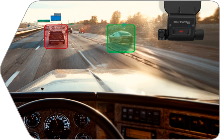
Put safety front, center and behind the wheel.
Prevent accidents and protect against false claims. Capture events as they unfold and help drivers self-correct at the moment with AI-powered, in-cab safety tech and smarter-than-your-average dashcams.
Two Column Swap and Slider
modules/Two Col Swap And Slider.module
Renders a two-column section whose columns can be reversed with a swap_columns boolean. The left content group holds an optional ribbon badge (rich text), heading, rich text description, a button (six style variants, three sizes, alignment) and an unlimited add_logos repeater of linked logo images. The right side is an unlimited right_content_group repeater of slides, each choosing between an image-with-text quote card (quote image plus rich text) or a plain image, with per-slide background color and a border-and-padding toggle; an add_slider boolean controls slider behavior. Style options cover section background color, heading color, four-breakpoint spacing, plus a decorative spiral image and custom ID. JavaScript runs the right column as an auto-playing Slick slider (one slide, no arrows or dots, 2 second autoplay).
Example: On a zonar.com partner or awards section, an editor would put a headline, a Get a Demo button and customer logos on the left, with a rotating slider of short customer quotes or award badges on the right.
Our Customers
Real fleets. Real challenges. Real wins.
Innovation that puts customers firt.A culture that puts employees first.Our dedication to excellence just happens to show.

Solutions Tabs
modules/Solutions Tabs.module
A flexible tabbed section with 1 to 8 tabs, each with a label, accent color and a layout choice between Two Column (image plus key features) and Column Grid (1 to 4 rich text columns). The two-column layout offers image position left or right, an image, heading, rich text content, full button group and a styled feature box with background and corner colors; each tab also has its own panel background, individual padding values, border color, width and radius. Section styles govern background, tab bar background, tab text color and font size, inactive indicator color and height, tab spacing, max width, panel background and padding, column gap and responsive spacing. JavaScript progressively enhances a details/summary accordion into ARIA tabs with click and keyboard arrow navigation.
Example: On a product family page, an editor would create tabs for Zonar Coach, ZFuel and EVIR, each showing a product screenshot beside a key features list with a Learn More button.
Tab 1
Key features
- Feature one
- Feature two
- Feature three
Tab 2
Key features
- Feature one
- Feature two
- Feature three
Tab 3
Key features
- Feature one
- Feature two
- Feature three
Partner Tabs
modules/Partner Tabs.module
A tabbed content module with 1 to 6 tabs, each holding a tab label, an accent color, a column count choice of 1 to 4 columns, and up to four rich text columns of content. Style fields control the tab bar background, tab text color, inactive indicator color, indicator height, overall max width, panel padding and column gap. It is built as a progressive enhancement: the markup is a details/summary accordion that works without JavaScript, and the script promotes it to accessible ARIA tabs with click and arrow-key, Home and End keyboard navigation, hiding the summary elements and showing only the active panel.
Example: On a partner program page, an editor would create tabs like Technology Partners, Resellers and OEM Integrations, each filling two rich text columns describing that partnership tier and its benefits.
Alliance partner
Alliance partner content.

Solutions partner
Solutions partner content.
Developer partner
Developer partner content.
Cooperative purchasing groups
Cooperative purchasing groups content.
EVIR Configuration Tabs
modules/EVIR Configuration Tabs.module
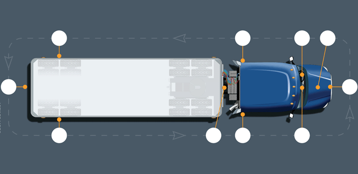
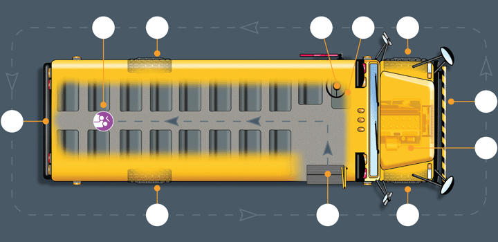
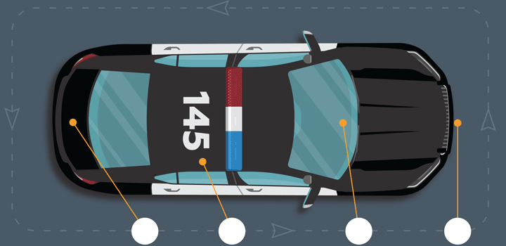
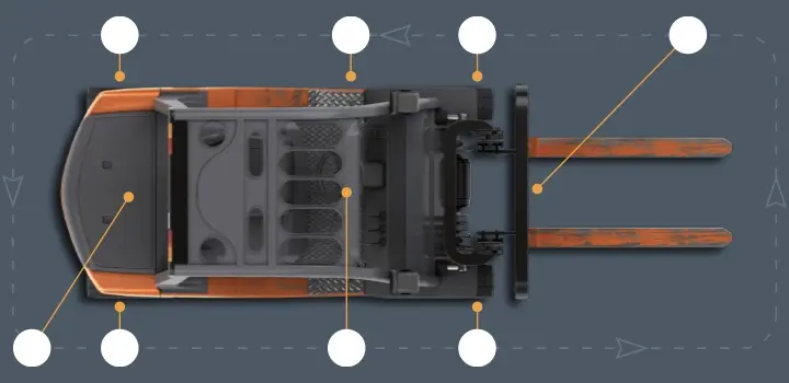
Renders an accessible tabbed image switcher for EVIR vehicle configurations. The tabs repeater (min 1, max 12) gives each tab a short label, an optional hover title, and a tab image shown in its panel; a separate static instructions image displays above the tabbed panels on every tab, and a section_id field provides an anchor. The JavaScript is a proper ARIA tab implementation: it manages role, aria-selected, aria-hidden and roving tabindex, switching the active panel on click with keyboard support. Style fields control section background, tab text, hover and active background/text colors, divider color, a max width in pixels, and responsive spacing at four breakpoints.
Example: On the zonar.com EVIR product page, an editor would create tabs for vehicle types like School Bus, Tractor, Trailer and Transit Coach, each showing a diagram of where inspection zone tags are mounted, with a shared how-to-inspect legend image above.
EVIR Asset Configurator
modules/evir_asset_configurator.module
A split content-and-carousel section built for showcasing EVIR asset configuration, with an eyebrow, heading and rich text body on one side and an auto-rotating image carousel on the other. The images repeater (1 to 12 items) takes an image plus caption each, and a CTA group provides a labeled link with six button style choices and three sizes. Layout options include image position left or right and an autoplay interval in milliseconds; style options cover background type (none, surface, custom color), heading, body and caption colors, and a content max width, while a settings group adds a section ID, top and bottom spacing presets (0, s, m, l) and a hide-on-mobile toggle. The JavaScript reads a data-eac-interval attribute and continuously rotates slides on a setInterval whenever there are two or more images.
Example: On the EVIR inspection product page, an editor loads six photos of asset inspection tags being configured on different vehicle types, sets a 4-second rotation, and points the CTA to a demo request form.
Fit each asset with the right inspection.
EVIR features inspection configurations for different types of vehicles, equipment and site inspections across industries. Trucks, buses, vans, special purpose assets, access tunnels, public facilities, classrooms, rooms with and without a view: EVIR will fit.